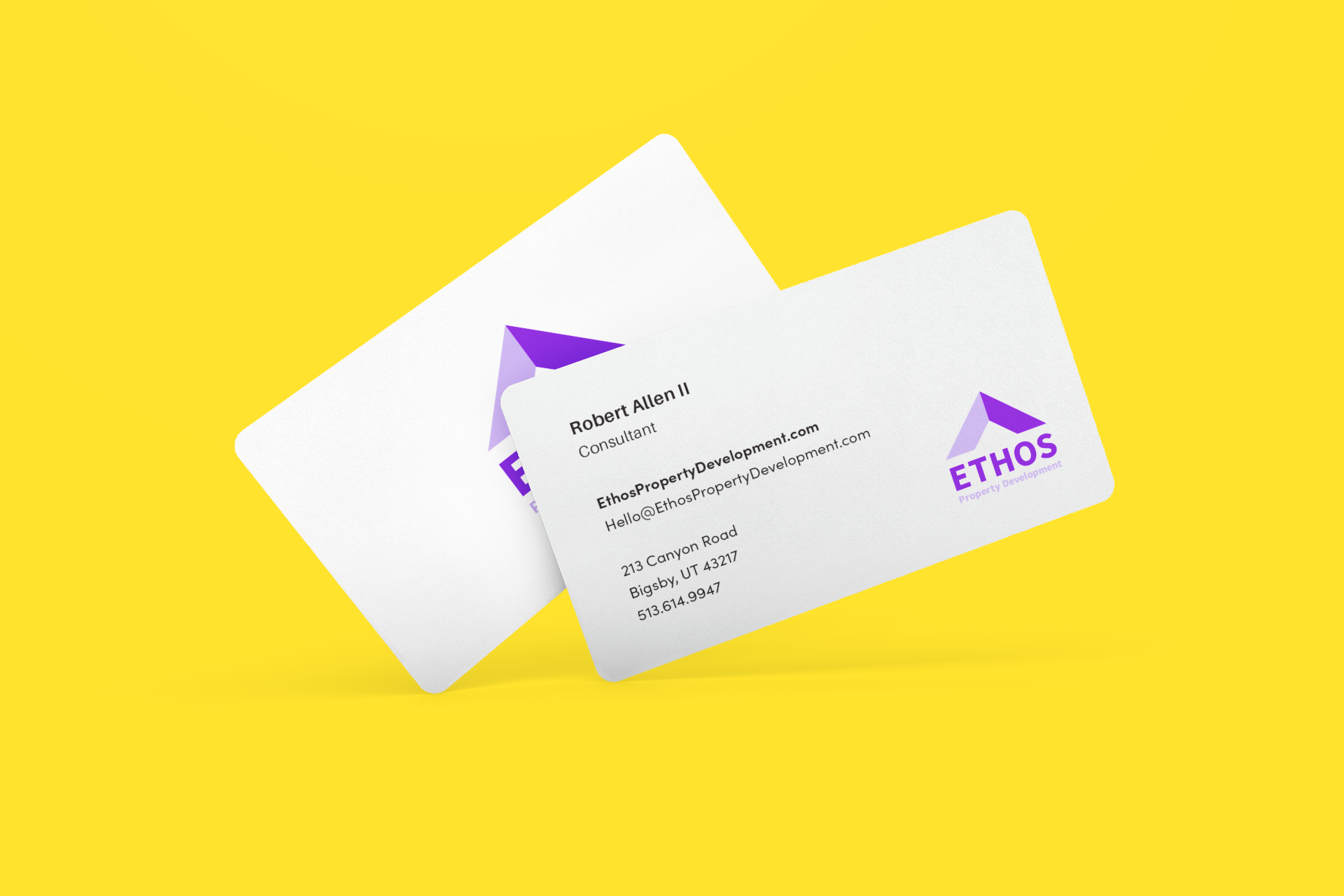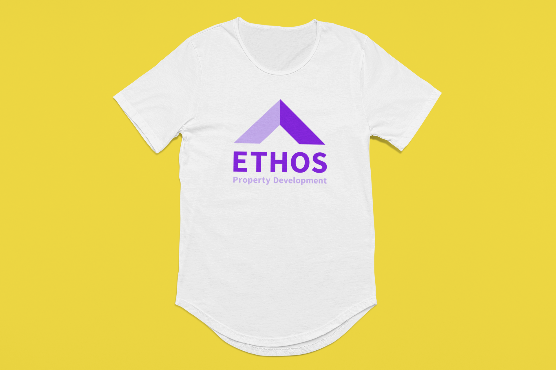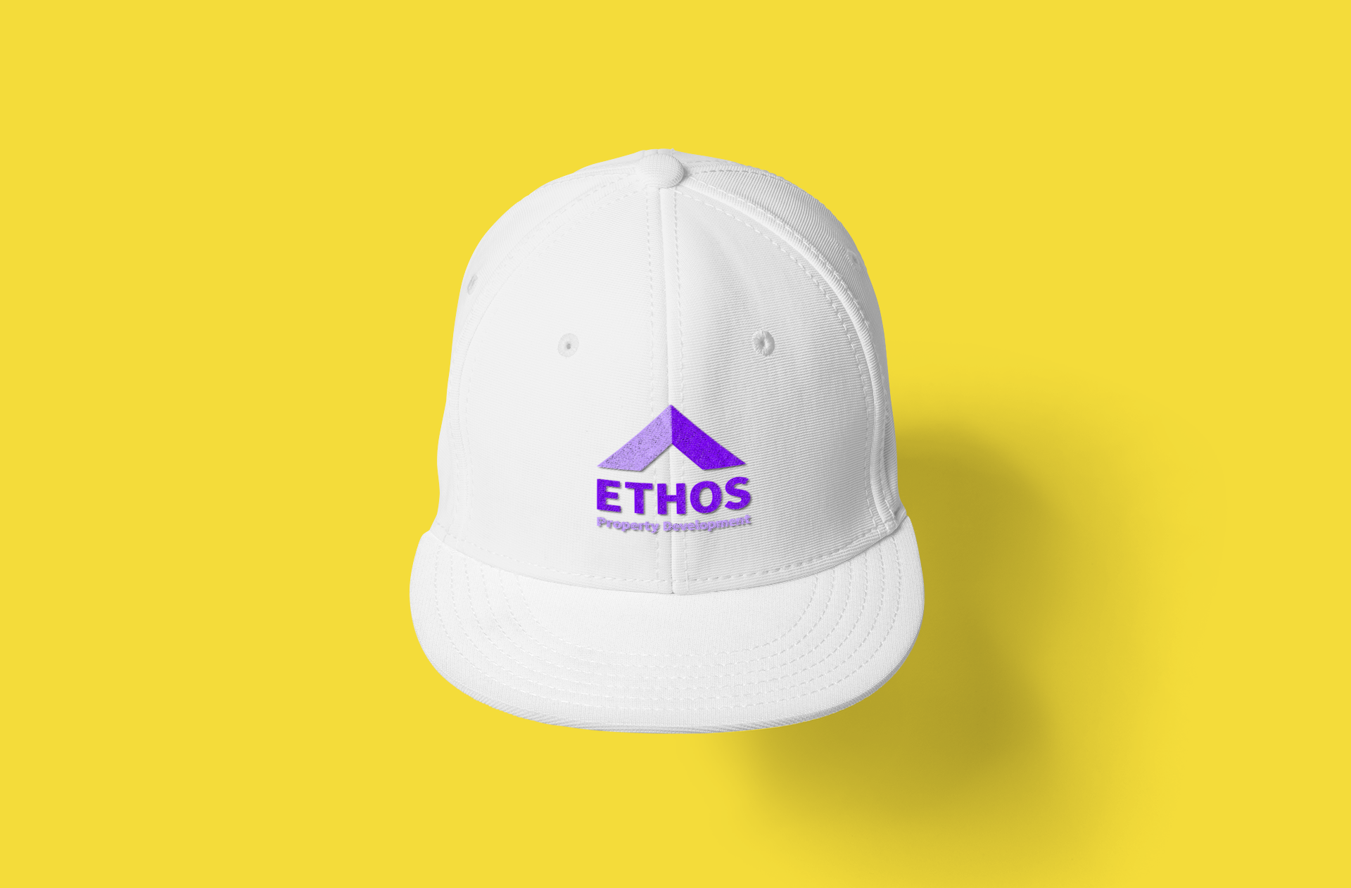

Ethos Property Development Logo and Identity
Ethos property development wanted a mark that was simple and economical in shape usage. So for this mark I made a simple and sharp roof line over the word ETHOS.
Its a perfect square and the ratio of the sub tag line is one third the overall size of the main word mark which is good for scaling down.